
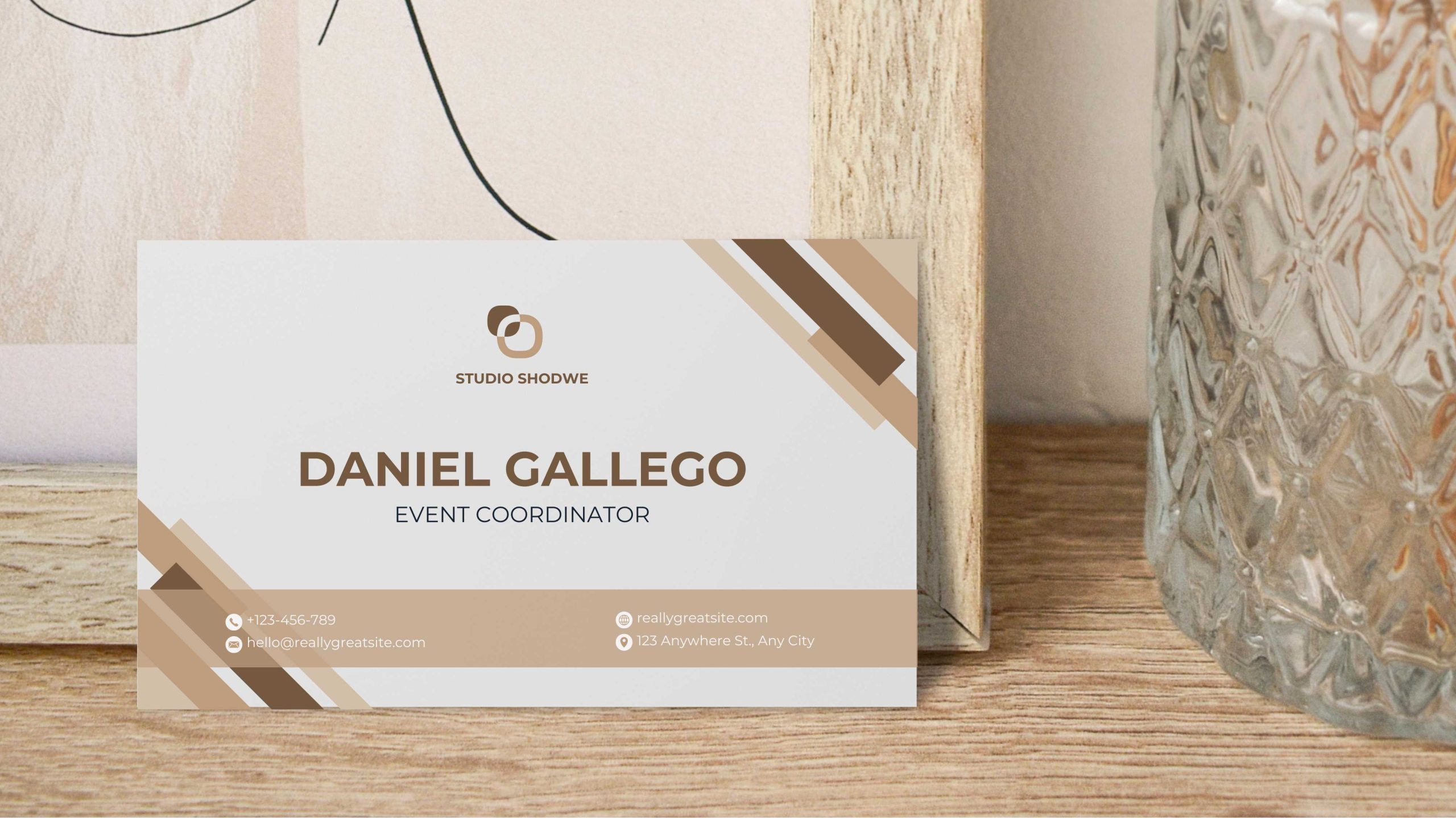
Minimalist Design: Clean and Sleek Business Cards design
business cards design, less is often more. If you want your card to make a lasting impression, adopting a minimalist approach can work wonders. Minimalist designs focus on simplicity, clarity, and elegance. They strip away unnecessary elements and allow the core message of your business card to shine. It’s a design philosophy that emphasizes clean lines, open space, and a laser focus on what really matters: your brand and contact information.
Why Minimalism Works for Business Cards design?
Minimalism is more than just a design trend – it’s a powerful way to communicate professionalism. Think about it: when you hand over a business card, you want it to reflect who you are and what your brand stands for. With a minimalist business card, you avoid clutter and give the receiver only the essential details. This makes your card easier to read and more memorable.
Imagine receiving a business card that’s overloaded with fonts, graphics, and colors. You’d probably feel a little overwhelmed and unsure of where to look first, right? A minimalist card, on the other hand, provides a clear focal point. Whether it’s your name, logo, or business name, the most important element stands out without competing for attention.
The Key Elements of Minimalist Business Card Design
So, what exactly makes a minimalist business card shine? Let’s break it down:
- Simple Layout: One of the first things you’ll notice about minimalist business cards is how clean they look. There’s no unnecessary text or complicated graphics. Instead, the design focuses on essential details – your name, title, logo, and contact information. The layout is usually organized with plenty of white space, giving the design room to “breathe.”
- Limited Color Palette: In minimalist design, colors are used strategically. You won’t find a rainbow of hues here. Instead, most minimalist business cards stick to a limited color palette – often just one or two tones. Neutral colors like black, white, or grey are common, but a bold accent color can be used to draw attention to key details, such as your logo or business name.
- Elegant Typography: The fonts you choose for your minimalist business card are crucial. Clean, simple fonts such as sans-serif or modern serif fonts are popular choices. These fonts are easy to read and give your card a polished, professional feel. Since typography is one of the main features of minimalist design, selecting the right font helps to convey your brand’s personality without needing excessive elements.
- High-Quality Material: While minimalism may focus on design simplicity, this doesn’t mean you should skimp on card quality. A sleek design printed on high-quality paper or card stock can elevate the overall feel of your business card. The texture and finish (such as matte or gloss) can subtly communicate luxury and professionalism, adding depth to the otherwise simple design.
Benefits of Minimalist Business Cards Design
Besides looking clean and professional, minimalist business cards offer several practical advantages. Firstly, they are timeless. Minimalist designs tend to age better than complex, trend-heavy cards that might look outdated after a few years. By keeping your design simple, you avoid needing constant updates, saving you time and money in the long run.
Secondly, minimalist cards are versatile. They work well across various industries, whether you’re in tech, design, consulting, or even creative fields like photography. The simplicity of the design allows it to adapt easily to different branding styles, making it a great option no matter what industry you’re in.
Lastly, minimalist business cards are memorable. Studies show that people remember things that are easy to process. By keeping the design simple, you make it easier for potential clients or partners to recall your information. When you only include the most important details, it leaves a lasting impression without overwhelming the person holding your card.
How to Customize Minimalist Business Cards design Templates
Now that you know why minimalist business cards are so effective, how can you create one without being a design expert? The good news is that with customizable templates, it’s easier than ever. Whether you’re using AI, PSD, or other editable formats, these templates allow you to easily tweak elements like colors, fonts, and layouts to suit your brand. With just a few clicks, you can create a professional, minimalist card that reflects your style.
Editable templates also give you the flexibility to experiment with different designs before settling on the final look. Try using various color schemes, playing with typography, or adjusting the white space. You’ll find that even small changes can have a big impact on the overall design.
Minimalist business cards design is a smart choice for anyone looking to make a professional and lasting impression. The clean and sleek aesthetic emphasizes simplicity while highlighting your brand’s key information. With a focus on elegant typography, limited colors, and spacious layouts, minimalist cards cut through the noise and deliver a clear message. Plus, with the availability of customizable templates, creating your own minimalist card is not only easy but fun. So, why overcomplicate things? Sometimes, the best way to stand out is by keeping it simple!
Step-by-Step Guide to Customizing AI/PSD/CDR Templates

Customizing templates can seem intimidating at first, but don’t worry! You don’t need to be a design wizard to make it work. Whether you’re using AI, PSD, or CDR formats, the process is straightforward once you get the hang of it. Business cards design is all about creativity, and using editable templates allows you to create something truly unique without starting from scratch. Let’s dive into the step-by-step process and unleash your inner designer!
Step 1: Choose the Right Template for Your Brand
The first step is to choose a template that reflects your business and personal style. With AI, PSD, and CDR templates, you have endless options. Are you going for a minimalist look or something more bold and colorful? Select a design that aligns with your brand image. The template is your foundation, so make sure it’s something you can easily customize to your liking. Look for templates that allow for easy adjustments in layout, colors, fonts, and logos to ensure you get the flexibility you need.
Step 2: Open Your Template in the Right Software
Once you’ve picked your template, it’s time to open it up in the right software. If you’re using an AI file, you’ll need Adobe Illustrator. PSD templates are meant for Adobe Photoshop, while CDR templates are best opened in CorelDRAW. Don’t worry if you’re not familiar with these programs; they’re pretty intuitive once you know where things are. If you’re new, plenty of tutorials on Adobe illustrator, Photoshop and Coreldraw can help guide you through the basics. When you open the file, the entire design will be neatly organized into layers, making it super easy to work on specific parts without affecting the rest.
Step 3: Customize Your Text and Fonts
Now comes the fun part! The first thing you’ll probably want to edit is the text on your business card design. Whether it’s your name, title, or business contact details, select the text layer and replace the placeholder information with your own. Be sure to keep it simple and legible. You don’t want your business card cluttered with too much text.
Next, you can play around with fonts. Most templates come with default fonts, but you can easily switch them out for something that matches your style. When choosing a font, remember to keep readability in mind. Sans-serif fonts are generally easy to read, but you can experiment with more creative options to make your design stand out. If you’re working in Illustrator, Photoshop, or CorelDRAW, you can install new fonts with just a few clicks, giving you a wider range of possibilities.
Step 4: Adjust the Color Scheme
A key part of personalizing your business card design is tweaking the color scheme to fit your brand. Most AI, PSD, and CDR templates allow you to change colors with ease. Start by selecting the elements you want to modify—this could be the background, text, or even small icons on the card.
If your brand has specific colors, like a signature shade of blue or a unique accent color, you’ll want to match these in your design. In Illustrator and Photoshop, you can use the eyedropper tool to pick and apply colors with precision. In CorelDRAW, similar color-editing tools are available, making customization a breeze. Remember, your color choices can significantly impact how your card is perceived, so opt for shades that evoke professionalism and creativity.
Step 5: Add or Replace Logos and Graphics
Your logo is one of the most important aspects of your business card, so it’s essential that it looks sharp and stands out. If your template includes a placeholder logo, you can easily replace it by importing your own file. AI, PSD, and CDR templates typically allow you to import logos in vector formats, ensuring your design looks crisp and high-quality no matter the size.
To replace the logo, simply click on the logo layer in your template and delete the placeholder image. Then, insert your logo into that space. Make sure to adjust its size and positioning so it fits perfectly. If your business doesn’t have a logo yet, you can explore some creative symbols or icons that reflect your brand. With editable templates, you have the freedom to experiment and find the best solution for your business.
Step 6: Fine-Tune the Layout
Once you’ve personalized the text, colors, and logo, it’s time to fine-tune the overall layout of your card. Business cards design is all about balance, so you want to make sure your elements are well-aligned and spaced evenly. Editable templates already come with a strong foundation, but you can make adjustments to fit your style.
In Illustrator, Photoshop, or CorelDRAW, use the guides or grid system to ensure everything is lined up neatly. You can adjust the spacing between text blocks or images to create a more visually appealing design. Don’t be afraid to move things around until you get a layout that feels right for you. Remember, sometimes less is more—too many elements can make the card look cluttered.
Step 7: Save and Export Your File
After you’ve completed all your customizations, the last step is to save and export your business card design. Each software has specific export settings, so choose the best format based on your needs. If you’re sending your design to a professional printer, exporting it as a high-quality PDF or a vector file (like EPS or SVG) is recommended. These formats ensure that your design will print clearly and without pixelation.
Make sure to save a copy of your original template file too. That way, you can go back and make changes whenever you need to update your contact details or branding.
Customizing AI, PSD, or CDR templates for your business cards design doesn’t have to be daunting. With just a few simple steps, you can personalize your card to reflect your brand while maintaining a professional and polished look. From selecting the right template to fine-tuning the layout and colors, the process is as fun as it is creative. Plus, editable templates save you tons of time, making them the perfect option for anyone looking to create custom business cards without hiring a designer. So, get started and watch your card come to life with just a few clicks!
Learn more about top 5 editable file formats every graphic designer should know!
Best Practices for Font and Color Combinations in Business Cards Design
When it comes to business cards design, two key elements can make or break your card: fonts and colors. These may seem like small details, but they play a major role in how your card is perceived. Picking the right combination can turn a simple card into a striking one, making it memorable and easy to read. Don’t worry, though—choosing fonts and colors isn’t rocket science. Let’s dive into some best practices to help you get it right!
Keep It Readable: Choosing the Right Fonts
When picking fonts for your business card, readability is king. You don’t want someone squinting to figure out what your card says, right? Stick to fonts that are clean and easy to read at a small size. Sans-serif fonts (like Arial, Helvetica, or Open Sans) are often the go-to choice for business cards because they have clean lines and are easy on the eyes.
If you’re feeling a little more adventurous, you can also mix in a serif font (like Times New Roman or Georgia) to add a bit of elegance or formality. The key is to not overdo it. Two fonts are usually enough for one business card design—one for the main text and another for headings or your name. Any more than that, and things can get cluttered fast.
Another tip? Make sure your font size is large enough to be legible but not so big that it takes over the card. For most business cards, the ideal font size for body text is between 8 and 12 points. Your name or title can be a little larger to stand out.
Color Contrast: Finding the Perfect Balance
Color combinations are just as important as font choices in business cards design. The goal is to make your card pop while still keeping it professional and easy to read. One of the best ways to do this is by using color contrast wisely. High-contrast color schemes, like black text on a white background or white text on a dark background, are popular because they’re easy to read and give your card a polished look.
If you’re feeling bold, don’t be afraid to experiment with colors! You can try combinations like navy blue and gold, or pastel pink and grey, to add some personality to your card. Just make sure there’s enough contrast between the text and the background. If the colors are too similar, your text might blend into the background, making it hard to read.
It’s also helpful to keep in mind that certain colors evoke specific emotions. For example, blue often conveys trust and professionalism, while red can signify energy and passion. When picking colors, think about how you want people to feel when they look at your card. Do you want it to feel modern, classic, or playful? Your color choices can help communicate that.
Creating a Visual Hierarchy
Fonts and colors work together to create a visual hierarchy, guiding the reader’s eye through the card. A good business card design directs attention to the most important information first—like your name or company logo—followed by other details like your job title and contact info.
To create this hierarchy, you can use a combination of font size, weight (boldness), and color. For example, your name might be in a larger, bolder font than your contact information, helping it stand out. You can also use different colors for different elements, like having your name in one color and your phone number in another. The goal is to make the card easy to scan quickly, so people can find the information they need without any hassle.
Don’t forget about white space, either! While it might be tempting to fill every inch of the card, leaving some space empty helps your design breathe and makes it more visually appealing. Plus, it keeps the focus on the important stuff.
Consistency Is Key
If you’re using your business card as part of a larger branding effort, make sure the fonts and colors you choose are consistent with your brand. If your website and social media use specific fonts and colors, carry that over to your business card design. Consistency helps create a cohesive brand identity, making your business look professional and well put together.
If you’re working with a template, double-check that your chosen fonts and colors align with your overall brand aesthetic. Editable AI, PSD, or CDR templates make it easy to customize your business card design without having to start from scratch, so take advantage of that flexibility.
Testing Your Design
Before you print a whole batch of business cards, it’s always a good idea to test out your design. Print a sample on your home printer to see how the fonts and colors look in real life. Sometimes what looks great on screen doesn’t translate as well to paper. If the colors are too bright or the font is hard to read, you can make adjustments before committing to a large print run.
Make sure your text is readable at arm’s length and that the colors look as you expected. Also, check that the contrast is high enough to make everything pop. It’s better to spend a little time testing and tweaking than to end up with 500 business cards you’re not happy with.
When it comes to business cards design, getting the right combination of fonts and colors is crucial. By choosing readable fonts, using color contrast effectively, and creating a clear visual hierarchy, you can design a business card that not only looks great but is also easy to read. Remember to keep things simple, test your design before printing, and, most importantly, have fun with it! Your business card is a small yet powerful tool for making a great first impression—so make it count!
Design Hacks: Utilizing Layers in Editable Files
If you’ve ever worked with AI, PSD, or CDR files, you’ve likely come across layers. Layers are the secret sauce to creating professional designs with ease, especially when it comes to business cards design. They allow you to work on individual parts of your design without affecting the rest of the file. Whether you’re new to the world of graphic design or an experienced pro, learning how to efficiently use layers can make your life a whole lot easier. Let’s walk through some design hacks that will help you get the most out of layers in your editable templates!
What Are Layers and Why Are They Important?
Let’s start with the basics: what exactly are layers? Think of them as transparent sheets stacked on top of each other, with each sheet holding different elements of your design. For example, one layer might have your background, another might hold your logo, and a third could contain your contact details. The beauty of layers is that they allow you to edit each component independently. If you want to change the background color without messing with your text, layers make it super simple.
Layers are especially handy when working on business cards design. Imagine you’ve designed the perfect card, but you suddenly realize you need to tweak the text. With layers, you don’t have to worry about shifting other elements like the logo or background; just edit the text layer, and you’re good to go!
Naming and Organizing Your Layers
One of the simplest yet most effective design hacks is to properly name and organize your layers. It might not seem like a big deal, but when you have multiple elements on your business card, keeping everything labeled will save you from a major headache down the road.
By default, your layers might be named something generic like “Layer 1” or “Layer 2.” But if you’ve got five different layers and none of them are named, finding the right one can feel like searching for a needle in a haystack. Instead, give each layer a descriptive name—like “Logo,” “Contact Info,” or “Background.” This makes it super easy to locate the layer you need, especially when you’re working with more complex designs.
You can also group layers into folders, which helps keep everything tidy. For instance, you can have one folder for text elements and another for design elements like logos and graphics. Most design software like Adobe Illustrator, Photoshop, and CorelDRAW lets you easily drag and drop layers into folders, so keeping things organized is a breeze.
Locking Layers to Avoid Mistakes
Have you ever accidentally moved a piece of your design while working on something else? It’s frustrating, right? That’s where layer locking comes in handy. Locking a layer means you won’t be able to move or edit anything on that layer unless you unlock it first. This is a fantastic way to avoid mistakes while you’re focusing on other parts of your business card design.
For example, once you’ve nailed down your background color or logo placement, you can lock those layers to ensure they stay in place. This way, you can make all the adjustments you want to the text or other elements without worrying about accidentally altering something important. It’s a small trick that can save you loads of time and frustration.
Using Layer Masks for Advanced Customization
If you want to take your business cards design to the next level, layer masks are a tool worth exploring. Layer masks allow you to control the visibility of different parts of a layer without permanently deleting anything. Think of it as non-destructive editing. You can hide or reveal specific parts of a design without losing any data. This gives you tons of flexibility to experiment with different looks.
For instance, let’s say you have a photo background and you want to blend it with a solid color or a gradient. Instead of deleting parts of the photo, you can use a layer mask to gradually fade out sections, creating a smooth, polished look. This can give your business card a unique, creative flair without the risk of making irreversible changes.
In Adobe Photoshop and Illustrator, adding a layer mask is as simple as clicking the layer mask icon at the bottom of the layers panel. In CorelDRAW, you’ll find similar masking options that work just as effectively. The best part? If you don’t like how the mask looks, you can adjust or remove it without affecting the original layer. No need to start over!
Layer Styles and Effects: Adding Flair to Your Business Cards design
Once you’ve mastered the basics, it’s time to have some fun with layer styles and effects. Most design programs offer a range of layer styles, such as drop shadows, glows, and bevels, that can give your business card design a professional and polished touch. Layer effects are perfect for adding subtle enhancements that make certain elements stand out without overwhelming the design.
For example, adding a subtle drop shadow to your text can create a sense of depth, making it pop off the card. You can also use stroke effects to outline important elements like your name or logo, giving them extra emphasis. These effects are customizable, allowing you to tweak the opacity, size, and color to fit your overall design.
One quick hack: don’t go overboard! While layer effects can add flair, using too many can clutter the design. A simple drop shadow or a soft glow is usually all you need to make your business card stand out in a subtle, elegant way.
Flattening Layers: When and Why to Do It
After you’ve finished perfecting your design, there’s one final step: flattening your layers. Flattening merges all the layers into one, which can be helpful if you’re ready to print or share your business card design as a final image. This ensures that nothing gets accidentally moved or altered once you’re done editing.
However, keep in mind that flattening is a permanent action. Once flattened, you won’t be able to go back and edit individual layers, so make sure you’re 100% satisfied with your design before doing this. A smart tip is to save a copy of your project with layers intact before flattening, just in case you want to make changes later.
Using layers is one of the best design hacks to make your business cards design process smooth and efficient. From organizing and naming layers to experimenting with layer effects, masks, and locking features, layers give you full control over your design without the stress of accidental changes. With these tips, you’ll be able to create professional-looking business cards while having fun along the way! So, dive into those editable AI, PSD, or CDR files and start layering like a pro, check out our all in one 650gb of editable templates bundle!
